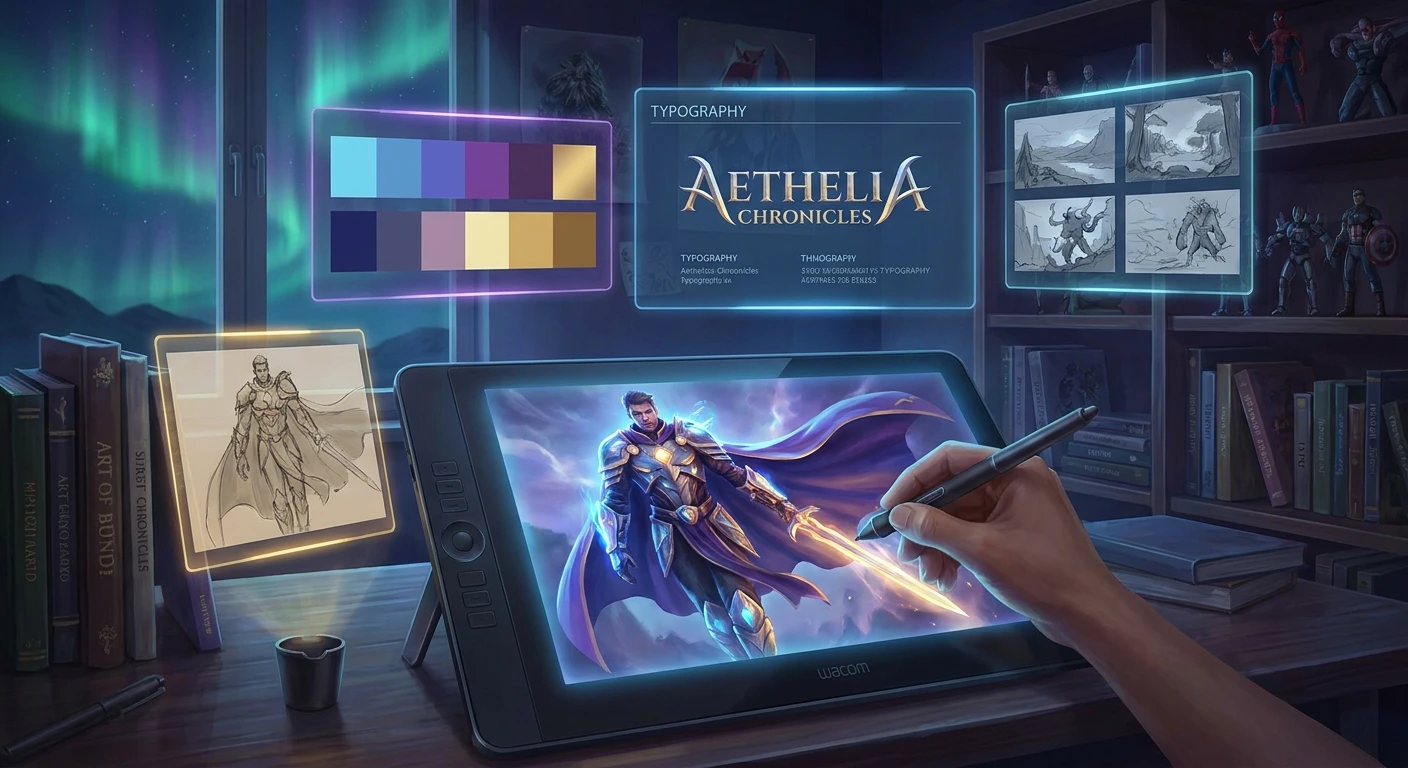
The Cultural Impact of Video Game Covers
You might not realize it immediately, but video game covers are the unsung heroes of the entertainment industry, constantly fighting for your attention on crowded digital storefronts and retail shelves. A single static image carries the massive responsibility of representing years of development, millions of dollars in budget, and the core emotional experience of an interactive journey. When a player scrolls through a digital library, they make a split-second decision based entirely on the visual punch of that key art. If the artwork fails to communicate the genre, tone, and quality of the title, even a mechanical masterpiece can be entirely overlooked by the gaming public.
Historically, game packaging was the primary bridge between the software and the consumer’s imagination. Back when graphics consisted of a few glowing pixels moving across a black screen, the dramatic, fully painted illustrations on the packaging provided the necessary context to make the virtual world feel real. Fast forward to the present day in 2026, and while the medium has shifted predominantly to digital downloads, the psychological weight of a great thumbnail remains absolute. The artwork sets expectations, builds immense pre-release hype, and eventually cements itself into the nostalgia of the culture. Great packaging art translates interactive mechanics into a single, breathtaking frame.
Read also: Latest Dragon Quest News and Updates; Everything You Need to Know About the guy game.
Decoding the Value of Masterful Key Art
Understanding why certain artwork resonates while others fade into obscurity requires looking at the primary objectives of marketing design across different eras. The core benefit of highly optimized artwork is instant brand recognition and emotional resonance, which directly drives higher conversion rates and sales.
Consider the differences in stylistic approaches over the decades:
| Gaming Era | Primary Marketing Objective | Signature Design Style | Iconic Example |
|---|---|---|---|
| The 1980s Arcade & Console | Compensate for primitive pixel graphics | Hand-painted fantasy and sci-fi illustrations | Atari’s Asteroids or Centipede |
| The 1990s Console Wars | Establish aggressive brand identity | Edgy character portraits and heavy logos | Sonic the Hedgehog on Sega Genesis |
| The 2000s 3D Boom | Showcase powerful 3D rendering capabilities | Detailed CGI character models holding weapons | Final Fantasy VII or Halo: Combat Evolved |
| Modern Digital Era (2020s) | Versatility across multi-platform thumbnails | High-contrast, minimalist silhouettes and neon colors | Elden Ring or Cyberpunk 2077 |
Excellent visual packaging provides massive value by communicating complex ideas instantly. For example, the original 1993 art for Doom by Don Ivan Punchatz immediately tells the buyer everything they need to know: one lone space marine fighting an endless horde of demons in a chaotic, adrenaline-fueled struggle. Contrast this with the Japanese release of Ico, featuring beautiful, minimalist watercolor artwork inspired by surrealist painters, perfectly communicating a quiet, mysterious puzzle-adventure.
To analyze what makes these designs function so perfectly, professionals look for specific compositional elements:
- Strategic Leading Lines: Masterful compositions use environmental elements, weapon angles, or glowing light sources to physically guide the viewer’s eye across the title logo and straight to the protagonist’s face.
- Intentional Color Palettes: Muted blues and grays immediately signal a gritty, mature narrative experience, whereas vibrant neon purples, yellows, and pinks communicate arcade-style action and accessibility.
- Utilization of Negative Space: Giving the main logo room to breathe against an open sky or dark void suggests confidence and prestige, a tactic frequently used by high-budget prestige titles.
- Silhouette Readability: Because modern art is often viewed as a tiny icon on a mobile screen, the character shapes must be instantly identifiable without any fine details.
Origins in the Arcade and Early Console Era
During the late 1970s and early 1980s, the graphical capabilities of home consoles like the Atari 2600 were heavily restricted. Players controlled basic geometric shapes, meaning the emotional heavy lifting fell entirely on the physical packaging. Companies hired traditional oil painters and comic book illustrators to create sprawling space operas, fierce barbarians, and terrifying monsters. This art tricked the brain, allowing the player’s imagination to fill in the gaps that the hardware could not render. The physical boxes were large, colorful, and designed to stand out on the shelves of electronics stores alongside televisions and stereos.
The Evolution Through the Console Wars
As the industry transitioned into the 16-bit and 32-bit eras, the competition between giants like Nintendo and Sega became fierce. Artwork became a strategic weapon. Interestingly, this era birthed massive regional differences in design. Japanese artwork often featured delicate, anime-inspired watercolors by legendary artists like Yoshitaka Amano. However, Western marketing executives believed these soft designs would not appeal to their local demographics. Consequently, American releases frequently featured heavily altered, aggressive, and “gritty” redesigns. The infamous “angry American Kirby” phenomenon, where the normally cheerful pink character was given furrowed eyebrows for US audiences, perfectly encapsulates the aggressive marketing mindset of this era.
Modern State of Digital Key Art
In our current landscape, the physical plastic box is largely treated as a collector’s novelty. The focal point is entirely on digital key art. This artwork faces a unique modern challenge: it must scale flawlessly. The exact same image must look incredible as a massive 4K splash screen on a PlayStation 5 dashboard, a wide rectangular header on Steam, and a tiny square icon on the Nintendo Switch eShop. This has led to a rise in central, highly contrasted character compositions that can be easily cropped and rearranged without losing the core identity of the game.
The Psychology of Key Art Composition
The science behind commercial illustration relies heavily on cognitive psychology and eye-tracking studies. When consumers browse a digital store, their eyes naturally follow a ‘Z-pattern’ across the screen, a standard habit in Western cultures trained to read left-to-right and top-to-bottom. Art directors intentionally place the most critical information—usually the game’s logo and the protagonist’s eyes—directly along the nodes of this Z-pattern. Furthermore, psychological studies show that when a character on the packaging makes direct eye contact with the viewer, it triggers a subconscious social response, significantly increasing the likelihood of the consumer stopping to read the title description.
Technical Rendering and Formats
Creating this artwork is a highly technical process that bridges raw artistic talent with rigid digital specifications. Artists do not simply draw an image; they engineer a massive, modular file designed for endless marketing applications. The technical requirements are staggering.
- A/B Testing Algorithms: Digital storefronts dynamically swap out thumbnail artwork for different user segments to gather data on which specific layout generates the highest click-through rate.
- Extreme Resolution Masters: The base artwork is often rendered at resolutions exceeding 10,000 pixels wide, allowing marketing teams to extract individual character layers for giant physical billboards without any pixelation.
- Dynamic Safe Zones: Artists must strictly adhere to complex template overlays ensuring that vital elements like characters’ faces and primary logos are not covered by automated UI elements, rating icons, or digital discount tags.
- Multi-Engine Integration: Modern key art frequently utilizes raw 3D assets directly from development engines like Unreal Engine 5 or Blender. These assets are posed and lit before being exported to software like Photoshop, where illustrators paint over the renders to add stylistic flair and correct lighting anomalies.
7-Day Blueprint: Designing Professional Key Art
Creating high-converting digital packaging requires a systematic approach. If you are an indie developer or an aspiring commercial illustrator, following a structured workflow ensures a professional result.
Day 1: Conceptualization and Mood Boarding
Begin by gathering reference materials. Look outside of gaming; analyze blockbuster movie posters, comic book covers, and classic oil paintings. Identify the core emotion your project needs to convey. Are you selling fear, adventure, speed, or mystery? Compile these references into a unified mood board.
Day 2: Sketching Silhouettes and Thumbnails
Open your digital canvas, but keep the zoom level low. Sketch out a dozen rough ideas using only black, white, and gray. The goal here is strict silhouette readability. If the composition is confusing or cluttered at the size of a postage stamp, it will completely fail when reduced to a digital storefront icon.
Day 3: Blocking in the Base Colors
Establish your primary color scheme based on color theory. Action titles frequently rely on the high-contrast pairing of teal and orange, while horror titles might use a monochromatic green or sickly yellow palette. Block these colors beneath your sketches to ensure the values pop against dark backgrounds.
Day 4: 3D Asset Integration and Posing
Take the actual character models from your game engine and pose them dynamically. Using the exact 3D models guarantees that the armor, weapons, and proportions are completely faithful to the gameplay. Set up basic virtual cameras to find the most heroic and impactful angle.
Day 5: Lighting Passes and Overpainting
Establish dramatic rim lighting in your 3D software to visually separate the main characters from the background canvas. Export this render into your painting software. Spend this day painting over the sterile 3D render, adding dynamic brushstrokes, atmospheric fog, and stylizing the textures to give it a hand-crafted, premium feel.
Day 6: Typography and Logo Integration
A masterpiece of illustration can be instantly ruined by amateur typography. Integrate your logo carefully, ensuring it has enough negative space around it to breathe. Check the edges against official platform templates to guarantee that rating boards like PEGI or the ESRB will not cover critical details.
Day 7: Formatting for Multi-Platform Deployment
The final step is slicing the master file. You will need to create specific aspect ratios: ultra-wide panoramic cuts for Steam library banners, tall vertical slices for physical retail boxes, and perfect squares for social media avatars. Ensure the focal point remains centered in every single format.
Debunking Industry Myths
Myth: Physical box packaging is completely dead and irrelevant to modern sales.
Reality: While digital dominates standard sales, premium physical editions and steelbooks are massive revenue drivers. Companies like Limited Run Games prove that highly curated physical packaging is highly sought after by collectors.
Myth: The programmers and level designers always paint the cover artwork themselves.
Reality: Development teams rarely handle the final commercial art. Publishers specifically hire external marketing agencies, specialized 3D rendering studios, or legendary freelance illustrators to ensure the marketing material meets specific commercial standards.
Myth: A busy, highly detailed image showing every character sells better.
Reality: Cluttered designs confuse the eye and perform poorly in digital metrics. The highest-converting thumbnails rely on a single, striking central figure framed against a clean, high-contrast background.
Frequently Asked Questions
Why do American and Japanese designs often look completely different?
Historically, regional marketing teams believed their specific audiences had wildly different tastes. Japan favored softer, artistic aesthetics, while Western markets demanded aggressive, action-oriented visuals to stand out in rental stores.
What makes the perfect digital thumbnail?
The perfect digital thumbnail has a highly readable character silhouette, a bold and legible logo, and striking color contrast that remains clear even when scaled down to a few pixels on a mobile device.
Who painted the original Doom artwork?
The iconic, chaotic illustration for the original 1993 release of Doom was created by the renowned fantasy and science fiction artist Don Ivan Punchatz.
Why are so many modern designs just blue and orange?
Teal and orange sit on opposite ends of the color wheel. This complementary color pairing provides the highest possible visual contrast, making characters naturally pop out against the background environment.
Do independent titles need professional key art?
Absolutely. For independent developers without massive marketing budgets, a striking piece of key art is often the only way to catch a consumer’s eye and drive wishlist additions on storefronts.
Can artificial intelligence generate good commercial packaging?
While AI can generate rapid concept variations, professional packaging requires exact brand consistency, specific engine asset integration, and complex layered files for marketing teams, which current AI struggles to execute perfectly.
Where can I find ultra high-resolution versions of these images?
Press kits provided by publishers often contain master files. Additionally, dedicated archival websites and community databases collect clean, text-free versions of iconic commercial art for preservation.
Does a bad design actually hurt sales?
Yes. If the artwork looks cheap, consumers instinctively assume the gameplay is also cheap and poorly coded. Poor visual presentation acts as an immediate barrier to entry.
The evolution of video game covers represents a fascinating intersection of pure artistic expression and ruthless commercial psychology. From the hand-painted fantasy landscapes of the 1980s to the meticulously engineered digital headers of today, these images remain a vital cornerstone of gaming culture. They capture our imaginations before we even press start. If you found this deep dive into visual marketing fascinating, be sure to share this guide with your fellow gamers and let us know which classic artwork remains your absolute favorite!



Leave a Reply